Product Design Lead · Case Study
A keyboard opened 500M+ times a month, designed to become anyone’s brand.
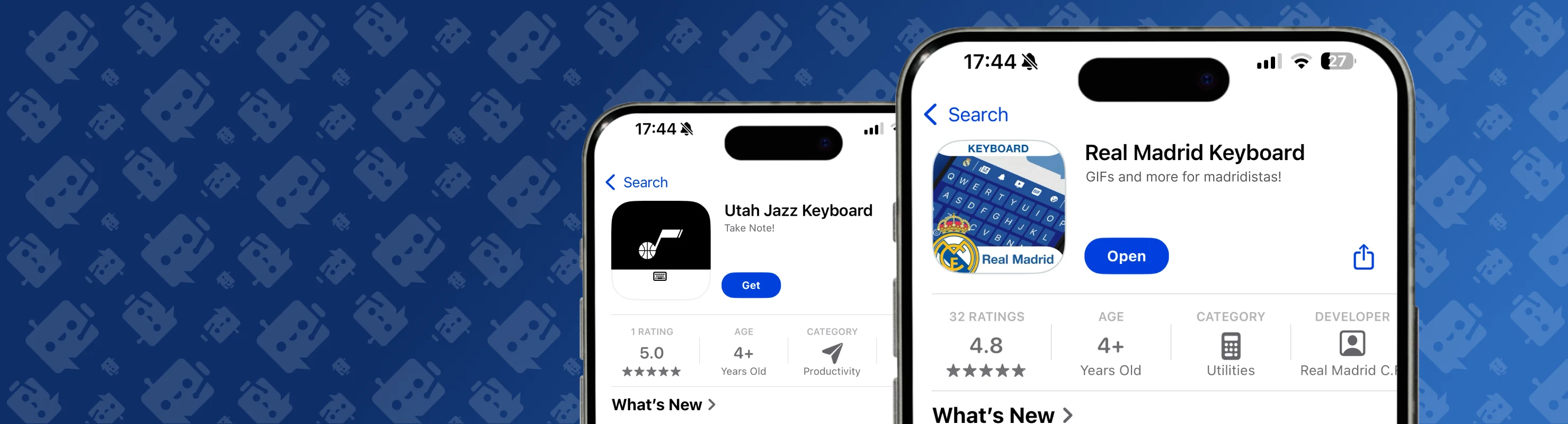
As Product Design Lead at Tappa, I shaped a white-label keyboard that partners, from Real Madrid, the NFL and the NBA to G2 Esports, embed inside their own apps or ship as their own: one system flexible enough to become any brand, accessible for everyone, and with usability tuned to keep people typing.
A keyboard is the most-used surface on a phone, and the easiest to get wrong. Every millimetre of touch target, every onboarding step, every contrast ratio compounds across hundreds of millions of opens.
One keyboard, built to become any brand.
The whole project, top to bottom. Open any step for a quick deeper read, or jump straight into the full section.
-
01
One system flexible enough to become Real Madrid’s, an NBA team’s or G2 Esports’, accessible for everyone, with usability tuned to keep people typing. Every millimetre of touch target, onboarding step, and contrast ratio compounds across hundreds of millions of opens.
-
02
I couldn’t predict who the next partner would be, so every decision had to work for any brand, and for users I’d never meet. The deliverable was a set of rules that lets one keyboard become any brand’s without losing usability or accessibility. Read the full section →
-
03
Keys, the suggestion bar, the toolbar, the invisible touch areas, long-press layers, and the modes on top. The map fixed which parts stay the same (and protect the experience) and which are open (and belong to the brand). Read the full section →
-
04
A third-party keyboard has a brutal first mile: enable it in settings, switch input methods, grant permissions. I rebuilt the first-time experience around the one question a new user is really asking, can I just start typing? Read the full section →
-
05
On the surface people touch most, accessibility is usability. Guardrails ensure a partner’s brand colours can never push the keyboard below the accessibility bar, no matter how they skin it. Read the full section →
-
06
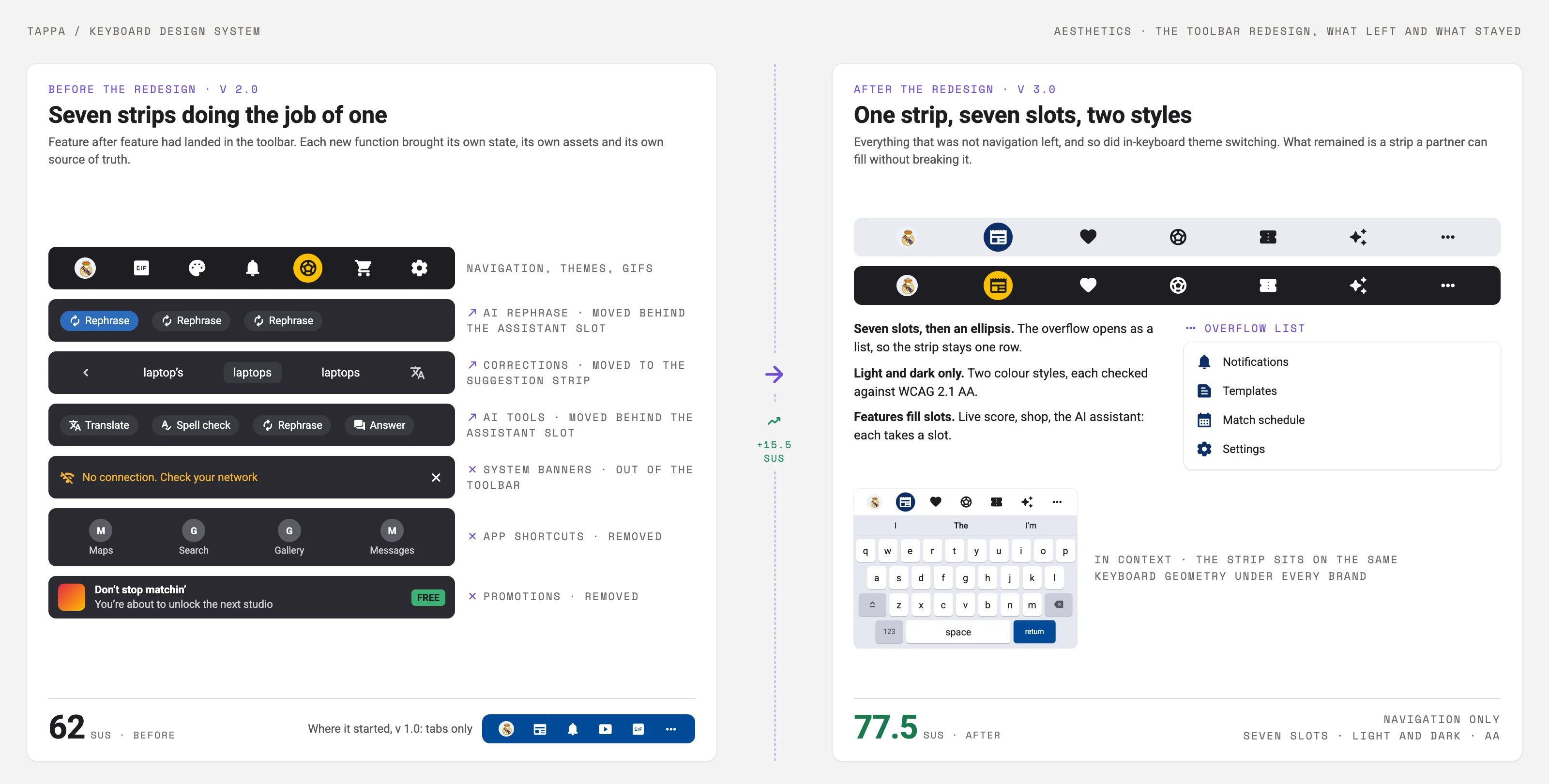
The hardest tension in the product: partners want their brand, the product needs consistency it can guarantee. The toolbar is the clearest example: v1 was a simple strip, features piled onto it for years, and v2 scored 62 on the System Usability Scale; research and an overhaul back to a simple strip, with the features integrated behind it, took it to 77.5. Read the full section →
-
07
G2’s app analytics showed its gamification section held fans more than twice as long as the shop, so the keyboard carried G2’s quests and points into every conversation. A Crazy 8s workshop produced 30+ ideas; my research team then interviewed nine gamers and game makers and surveyed 1,185 US mobile gamers on what brings people back. The gamification layer shipped with G2. Read the full section →
-
08
At 500M+ opens a month, a single onboarding step, touch target or contrast value repeats hundreds of millions of times. Small decisions move the numbers. Read the full section →
The product
One engine, many faces.
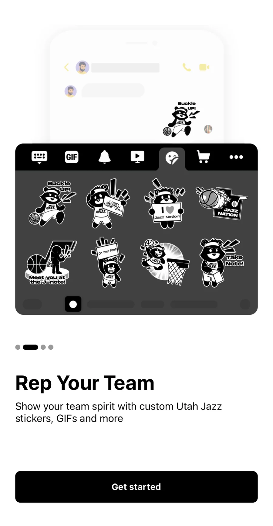
Tappa is a keyboard other brands ship as their own. Some partners embed the SDK inside their app; others ship a standalone keyboard app under their brand, published by Tappa or, as Real Madrid chose, by the club itself. Either way the partner skins it: Real Madrid’s keyboard for its fans, the Utah Jazz’s for Jazz Nation, G2 Esports’ for its community, each with bespoke themes, stickers and content.
That model set the central design constraint: I couldn’t predict who the next partner would be, so every decision had to work for any brand, and for users I’d never meet. The deliverable was a set of rules that lets one keyboard become any brand’s without losing usability or accessibility.
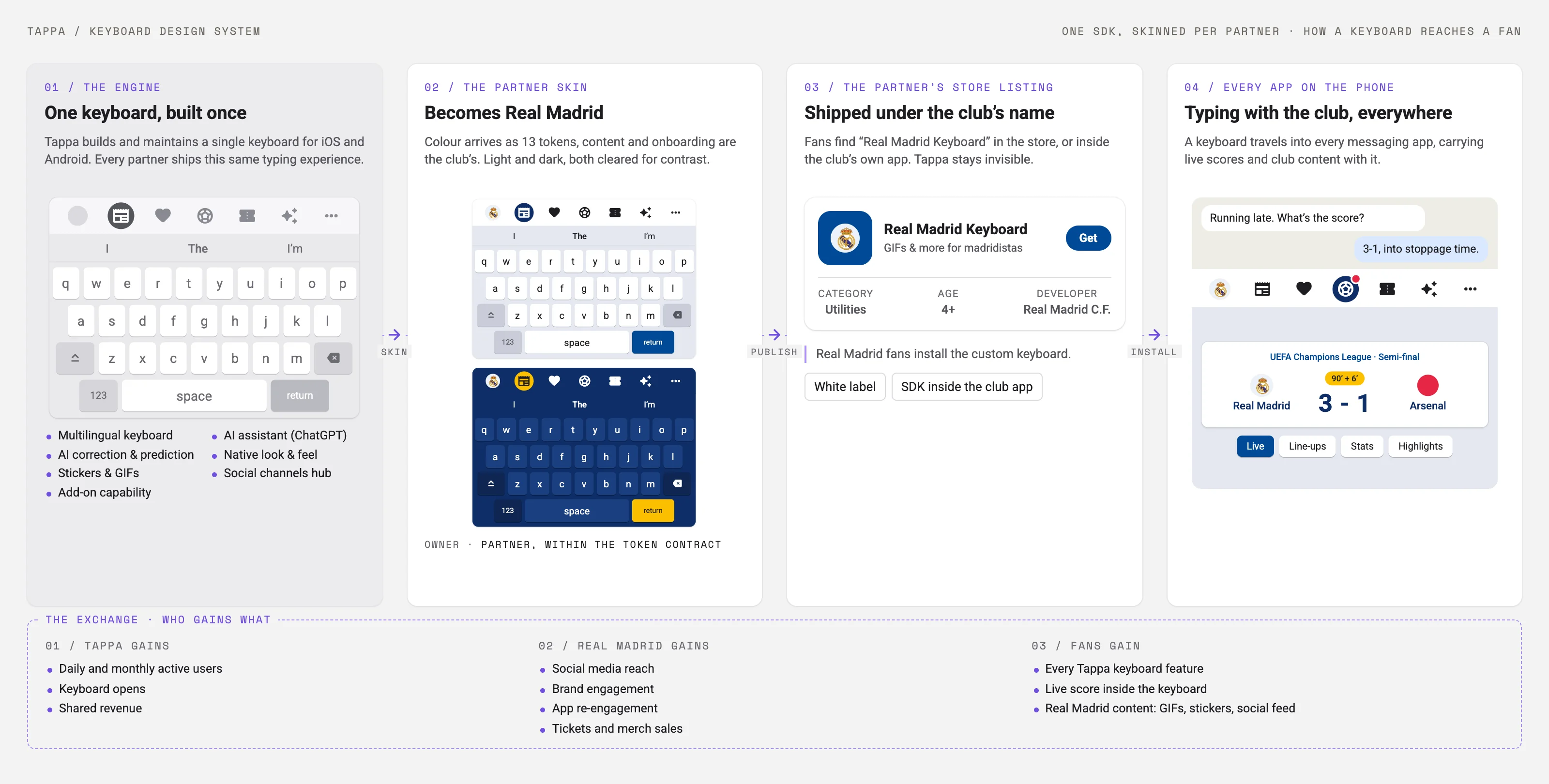
Partners buy reach as much as a keyboard. In the pitch to Real Madrid, the argument was frequency: a fan opens the keyboard 80+ times a day, in every app they type in, which gives it a daily-to-monthly active ratio far above a normal app’s. In return the club gets a social hub with its own feeds inside the keyboard, its own stickers and curated GIFs, one-tap links to tickets, merch and its app, and live scores during matches. Tappa sees only keyboard usage data; everything else stays the partner’s, and a full integration takes one to one and a half months.
Four problems defined the work: anatomy (mapping the system), usability (getting people set up and typing), accessibility (working for everyone), and aesthetics (a brandable system that stays consistent).
Anatomy
Map the system before changing any part of it.
A keyboard looks simple but isn’t. It has keys, a suggestion bar, a toolbar, an invisible heat/touch area beneath each key, long-press layers, and the modes layered on top: emoji, GIF, stickers, settings. Before any part could be themed, resized, or swapped, I documented the full anatomy so a change in one place never broke the typing experience underneath.
That map set the rule for everything that followed: which parts are fixed (and protect the experience) and which are open (and belong to the brand).
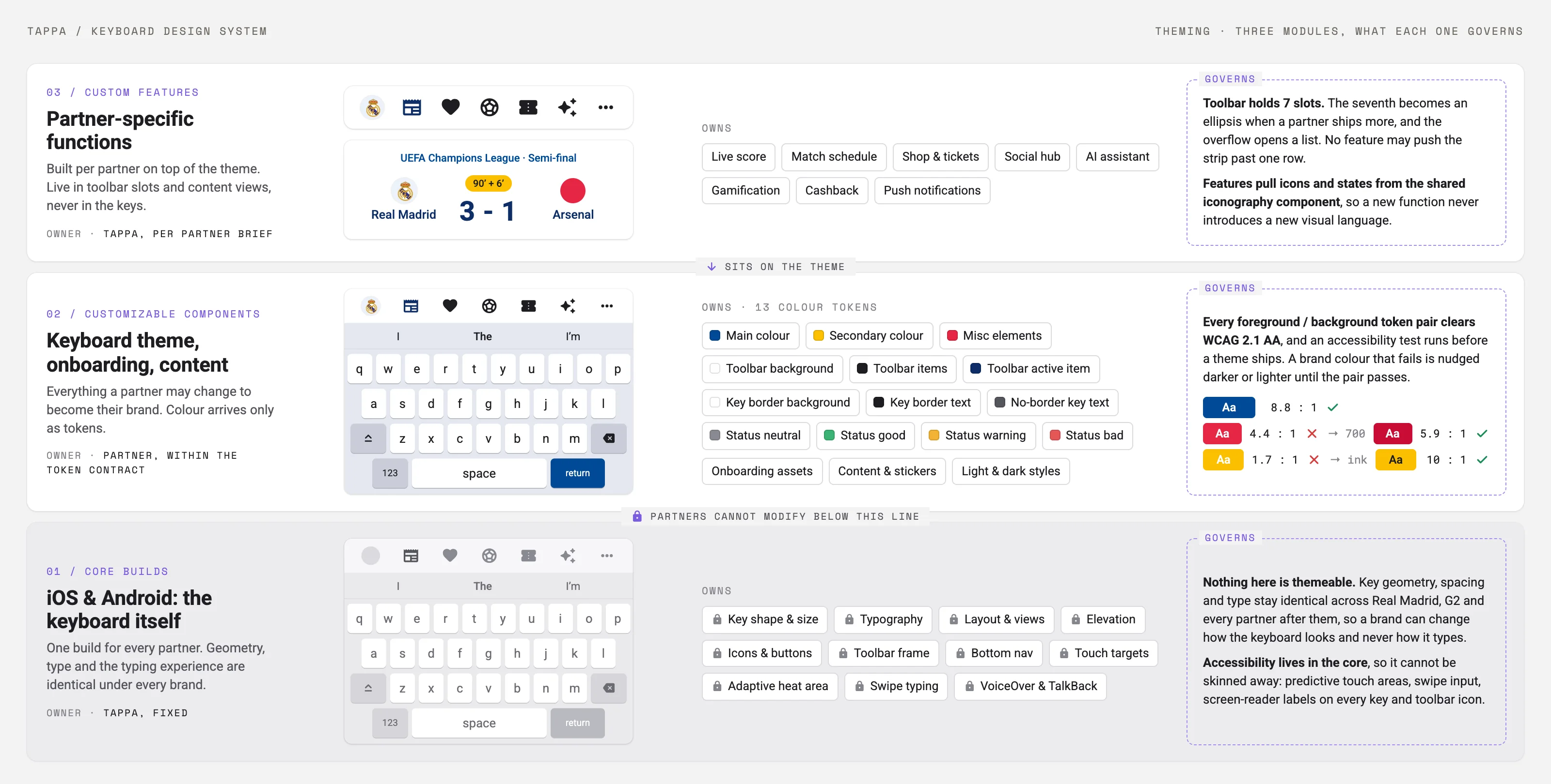
The figure below is that map. Three modules: the core build Tappa owns (layout, key shape and sizes, type, the typing engine itself), the layer a partner sets (colour tokens, onboarding assets, content), and the custom features built per partner (live score, shop, social hub, AI assistant). Underneath, the rules that hold all three together: every colour pair checked for contrast, a test before any theme ships, seven toolbar slots and an overflow list.
Usability
The fastest way to lose a keyboard user is the setup.
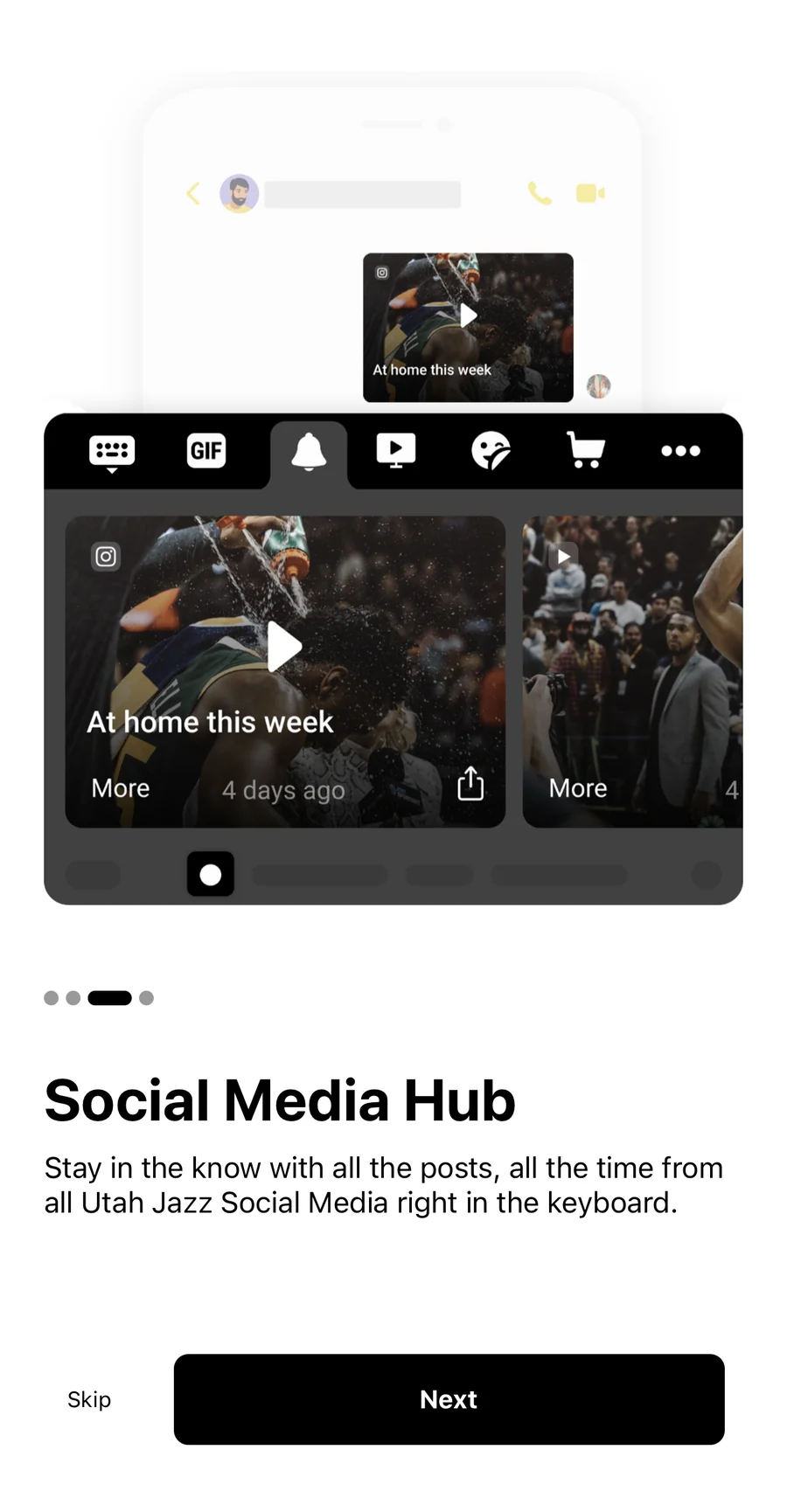
A third-party keyboard has a brutal first mile: enable it in settings, switch input methods, grant permissions, configure. Working with the BI team, we saw huge drop-offs across the onboarding steps. That sent my research team into testing sessions on a partner build, the Calgary Flames keyboard, and the sessions confirmed the onboarding was tedious: all five testers went looking for the theme setting in the wrong place (one reported it as a bug), finding a single emoji took over a minute and a half because there was no search, and all five asked for GIF search before they’d finished scrolling. The onboarding itself ran 12 steps, spread across screens, with instructions users couldn’t hold in their heads. I rebuilt the first-time experience around the single question a new user is really asking: can I just start typing?
Before · 12 steps
- Long settings detour with no guidance
- Permissions asked cold, without context
- Drop-off before the first keystroke
After · 4 steps
- Guided enable, in context
- Permissions explained at the moment they matter
- Typing sooner, fewer reasons to bail
Cutting the FTUE from 12 steps to 4 shortened the path to the first keystroke, the moment a partner’s user decides whether the keyboard stays. The same sessions showed users wanted search for content, so GIF and emoji search shipped alongside the new onboarding: two fixes from one round of research. A second round, 20 US users installing the G2 keyboard unmoderated, confirmed the flow: every one of them completed the installation.
Accessibility
It has to work for everyone, on the surface they touch most.
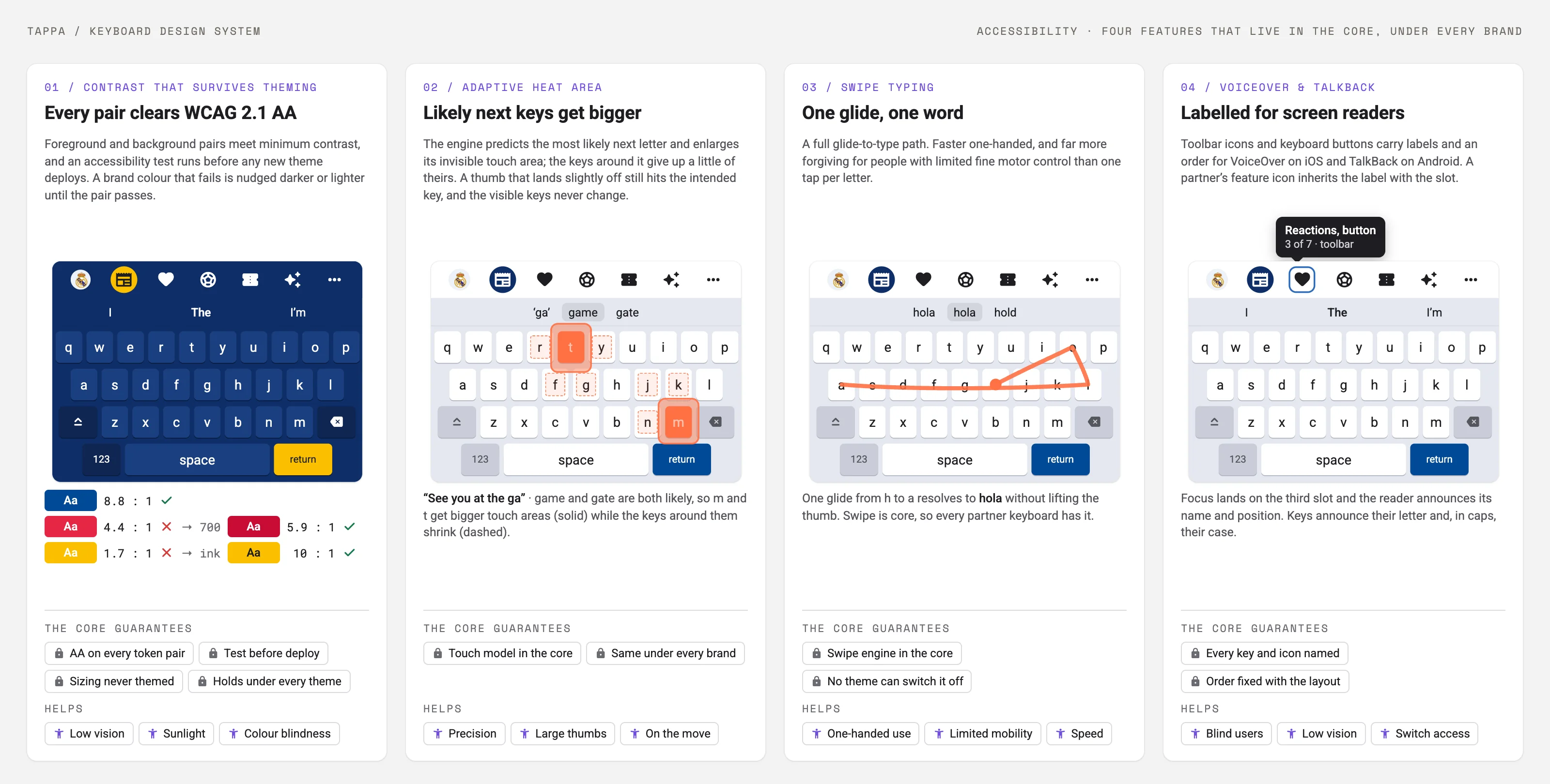
The design meets WCAG 2.1 AA and goes past the checklist, because on a keyboard accessibility is usability:
- An adaptive heat area, where the engine predicts the likely next letter and grows its invisible touch target, so mistypes drop without changing how the keyboard looks.
- Swipe typing, a full glide-to-type path, faster one-handed and far more forgiving for motor-limited users.
- VoiceOver and TalkBack, with every key, mode and control labelled and ordered for screen readers on both platforms.
- Contrast and sizing that survive theming, with guardrails so a partner’s brand colours can never push the keyboard below the accessibility bar.
Under the visible keys sits the layer people never see but feel constantly: autocorrect, next-word prediction and spell check, and the adaptive heat area, a model that predicts the likely next letter and quietly grows its touch target. To tune it, my research team ran a benchmark: 26 people, half on iOS and half on Android, typed the same 262-word passage first on their own keyboard and then on ours, while we logged speed, mistakes, autocorrects and how often they used the suggestions. The recordings showed where the keys failed people: the row above the space bar caught mis-taps, the emoji trigger sat where thumbs land, keys didn’t scale across screen sizes, and autocorrect touched proper nouns it should have left alone. The adaptive heat area came out of that study.
Aesthetics
A system that’s brandable, and still consistent.
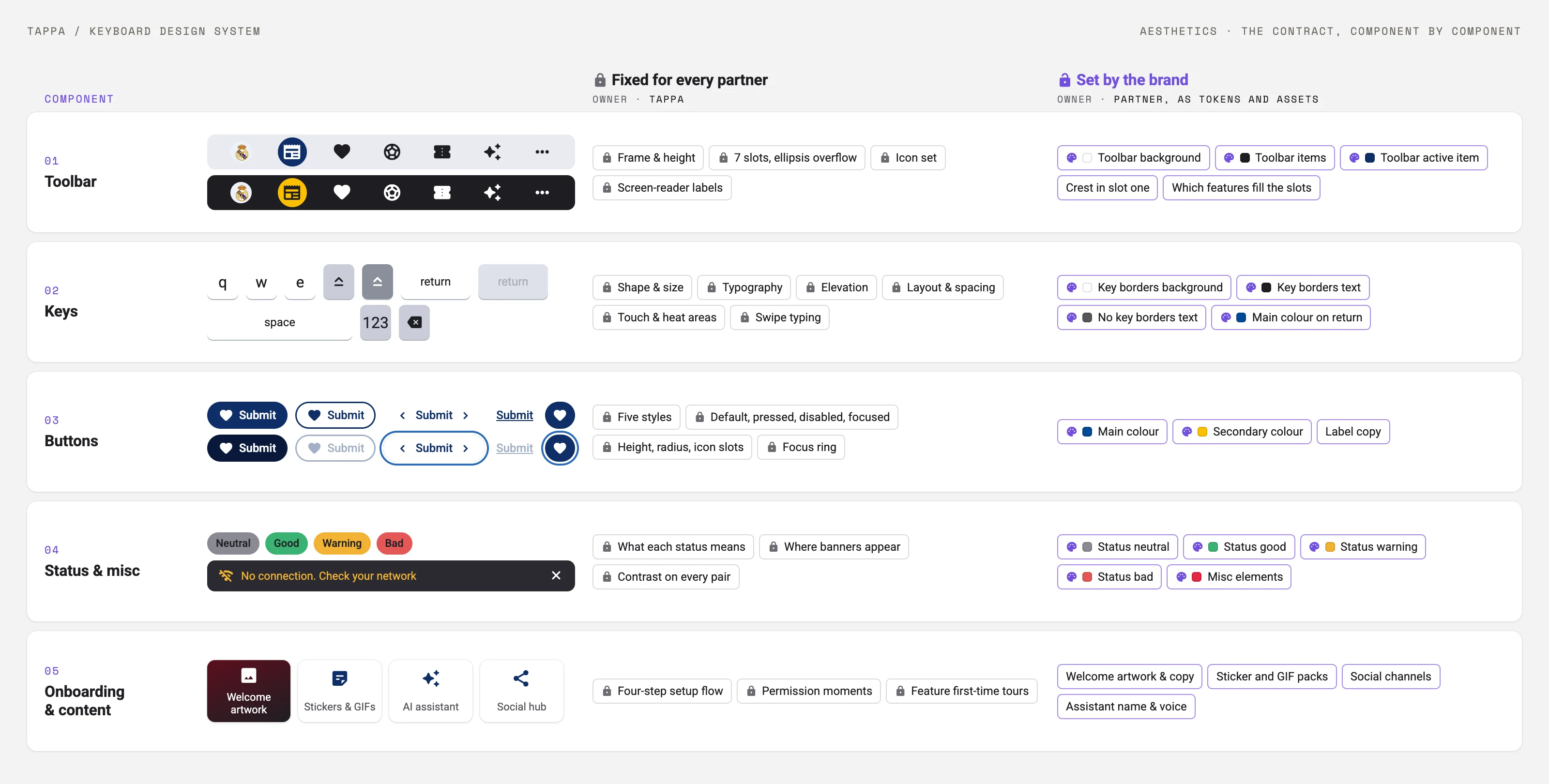
The hardest tension in the whole product: partners want their brand; the product needs consistency, usability, and accessibility it can guarantee. I resolved it with a three-tier design system; the first two tiers, the ones that meet on every key, are compared below.
Fixed core
- Layout, spacing & touch logic
- Key shape, type & sizes
- Accessibility guarantees
- The typing experience itself
Brand layer
- Colour tokens
- Onboarding assets & content
- Toolbar features & identity
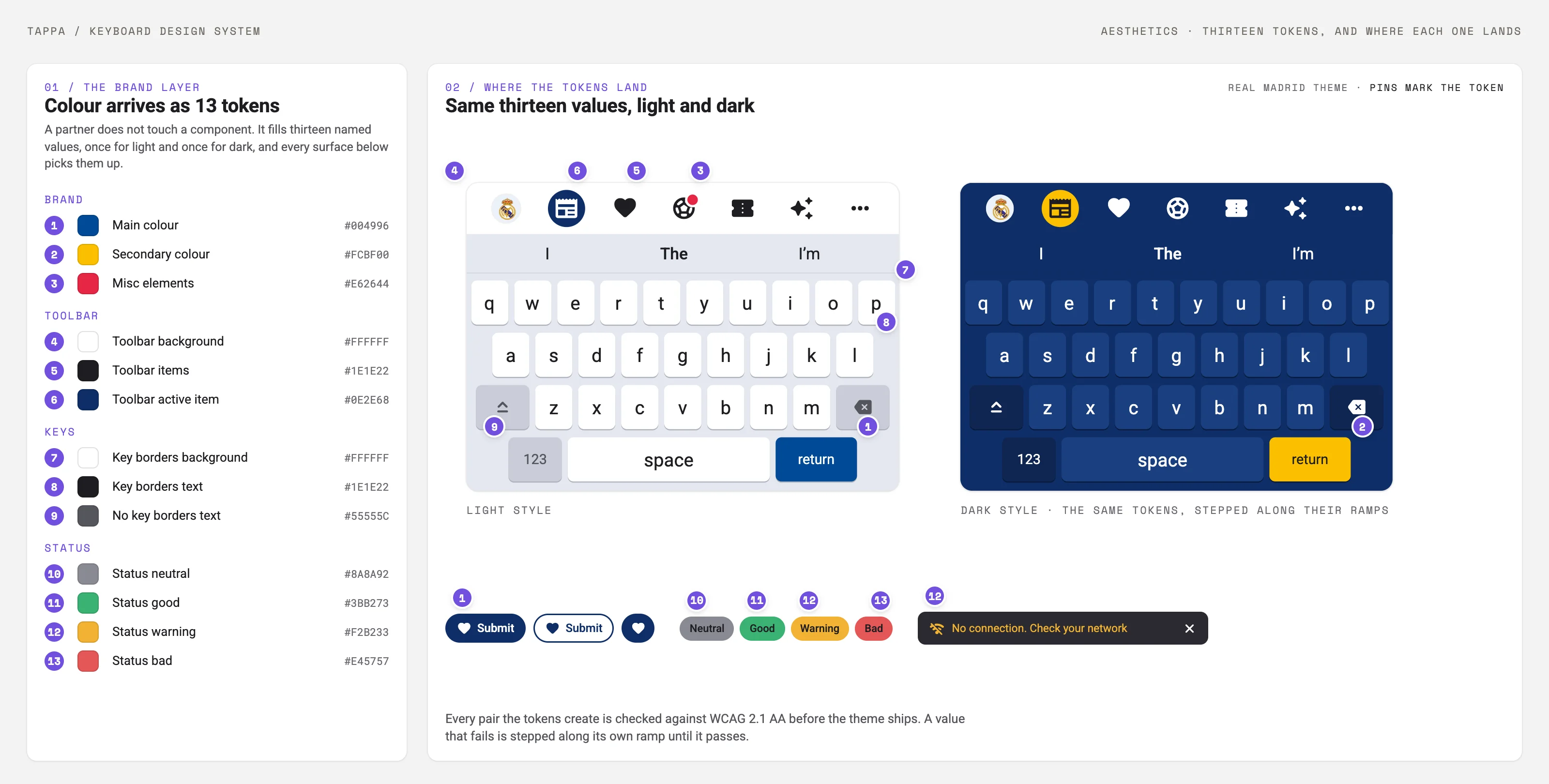
The first-time-experience test gave the brand layer its evidence: look and feel scored highest of every indicator my research team measured, and testers named the toolbar and the dark themes as the reasons the keyboard felt like a product rather than a utility. The same test also recorded the complaint the toolbar had accumulated: settings “clogged with options”.
Iterating the toolbar
The toolbar, the strip that carries a brand’s features, started simple. Over the years it gathered fluff: every new function landed in it as its own strip, until the version 2 toolbar scored 62 on the System Usability Scale. The research pointed one way. Reverting to a simple navigation strip, with the features integrated behind their slots instead of piled on top, took the score to 77.5.
Strip by strip, this is what left and what stayed:
Re-engagement
A keyboard that brings fans back to the partner’s app.
A keyboard is open in every app a fan types in, which makes it an unusual re-engagement channel: it reaches people without a notification. In late 2022 I built the case for using it that way with G2 Esports. Their app’s analytics made the argument: the gamification section, with its points, raffles and rankings, held fans more than twice as long per visit as the shop, and the shop was where the revenue was. If the keyboard carried the quests and points into every conversation, it could route that attention back to the app.
I ran a Crazy 8s workshop with the team to turn that into features. Four ideas were ready to build: G2’s quests and points inside the keyboard, smart notifications for shop discounts and upcoming matches, themes tied to the games G2 plays, and a curated news feed through the social hub.
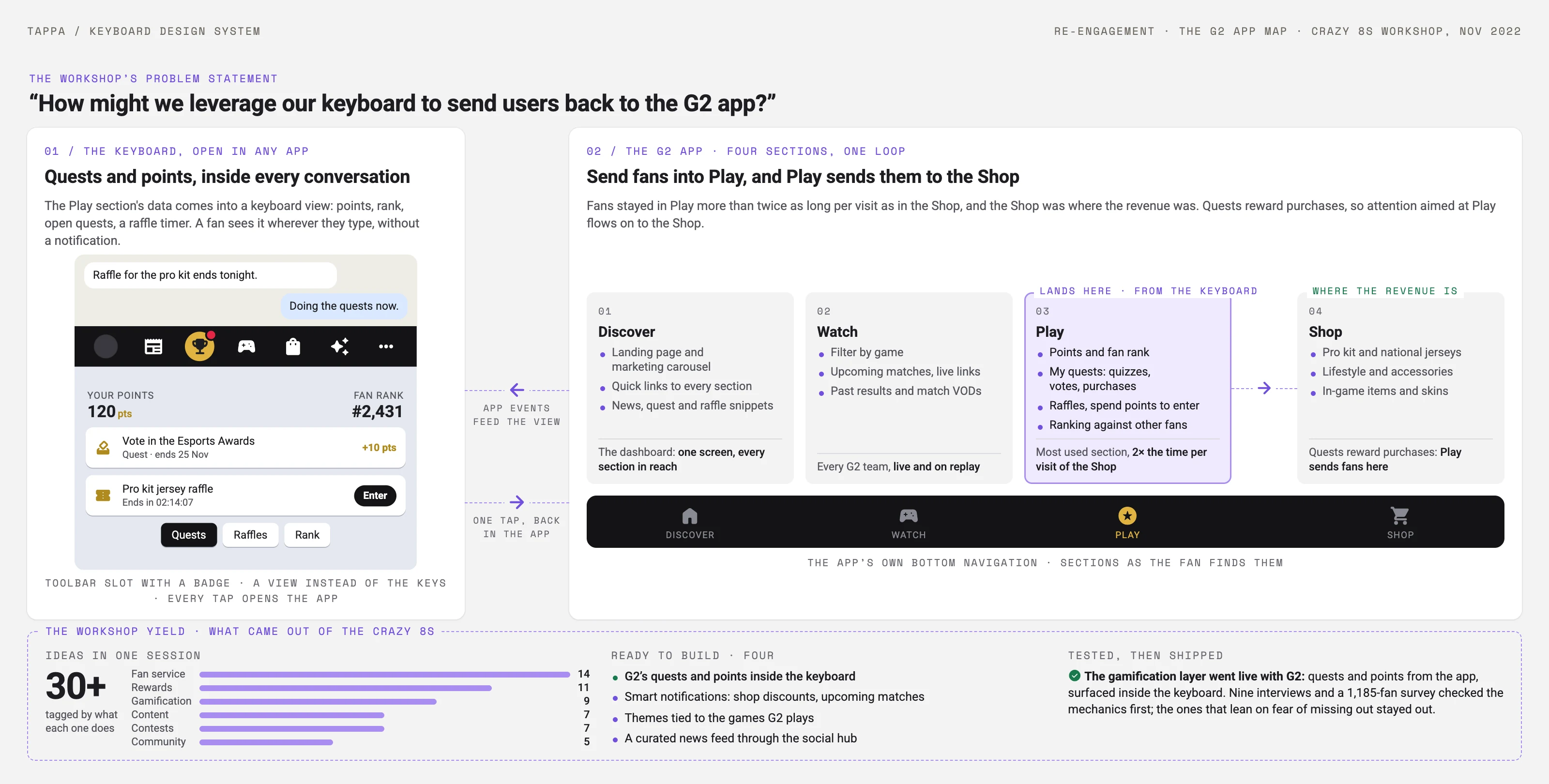
Before anything shipped, my research team tested the assumptions. Nine interviews mapped what brings people back to a game and which mechanics they resent; the ones that lean on fear of missing out or sunk cost were flagged as risks and stayed out. The survey put numbers on the rest: 54% of players keep game notifications on, and of those who don’t, 63% turned them off the first time the game asked, so a bad first notification is also the last one a player sees. Daily rewards bring 45% of players back, filling an idle moment brings back 43%, and players with notifications on play more often, longer and spend more across almost every cut of the data.
The gamification layer went live with G2: quests and points from the app, surfaced inside the keyboard.
What the numbers showed.
Across partners like Real Madrid, the NFL, the NBA and G2 Esports, the keyboard became a surface used hundreds of millions of times a month, and the design work showed up in the metrics that matter to a white-label business:
The 1.5× in partner app opens has a mechanism behind it: the toolbar’s logo slot, shop and tickets lead fans back into the partner’s app, so every keyboard session is a chance to re-engage them.
The lesson that carried forward: at 500M+ opens a month, a single onboarding step, touch target or contrast value repeats hundreds of millions of times. Small decisions move the numbers.